Select projects
Erica Tanov
Chanintr 30
Spruce
Wrapd
Logos
Global Health Reporting Center
San Francisco Design Week
AGDA + Mucho
Chinoz
Octovo packaging
Posters
Archive
Erica Tanov
Chanintr 30
Refractory
Pergo
Spruce
Art Gallery of NSW
Wrapd
Logos
Global Health Reporting Center
San Francisco Design Week
London Design Festival + DNCO
AGDA + Mucho
AIGA San Francisco
Apple Music Password required
Chinoz
Octovo identity
Octovo packaging
Kohler Honed White
Posters
Archive
I acknowledge the Gadigal of the Eora Nation, the traditional custodians of the Country on which I stand.
Refractory
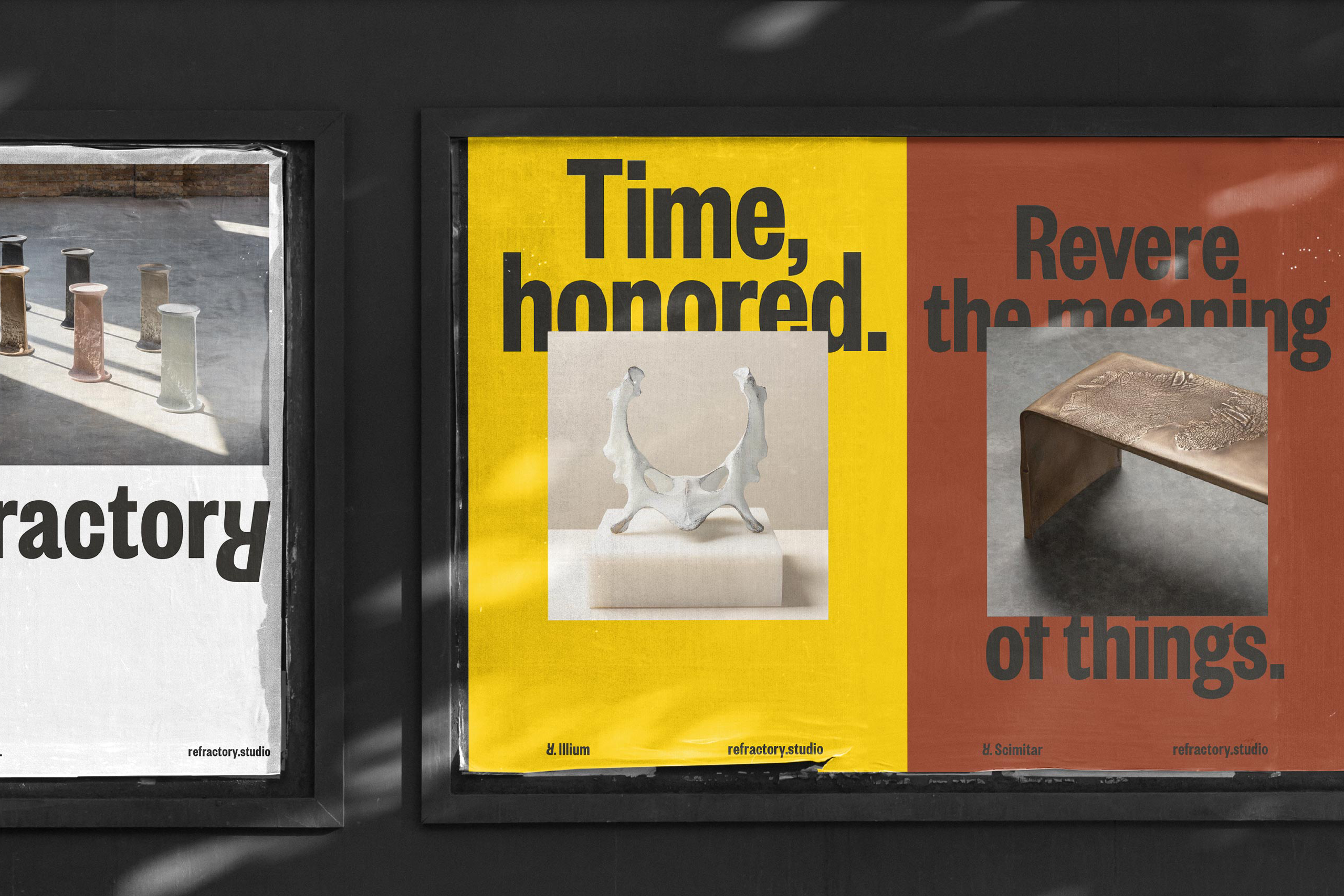
Revere the meaning of things.
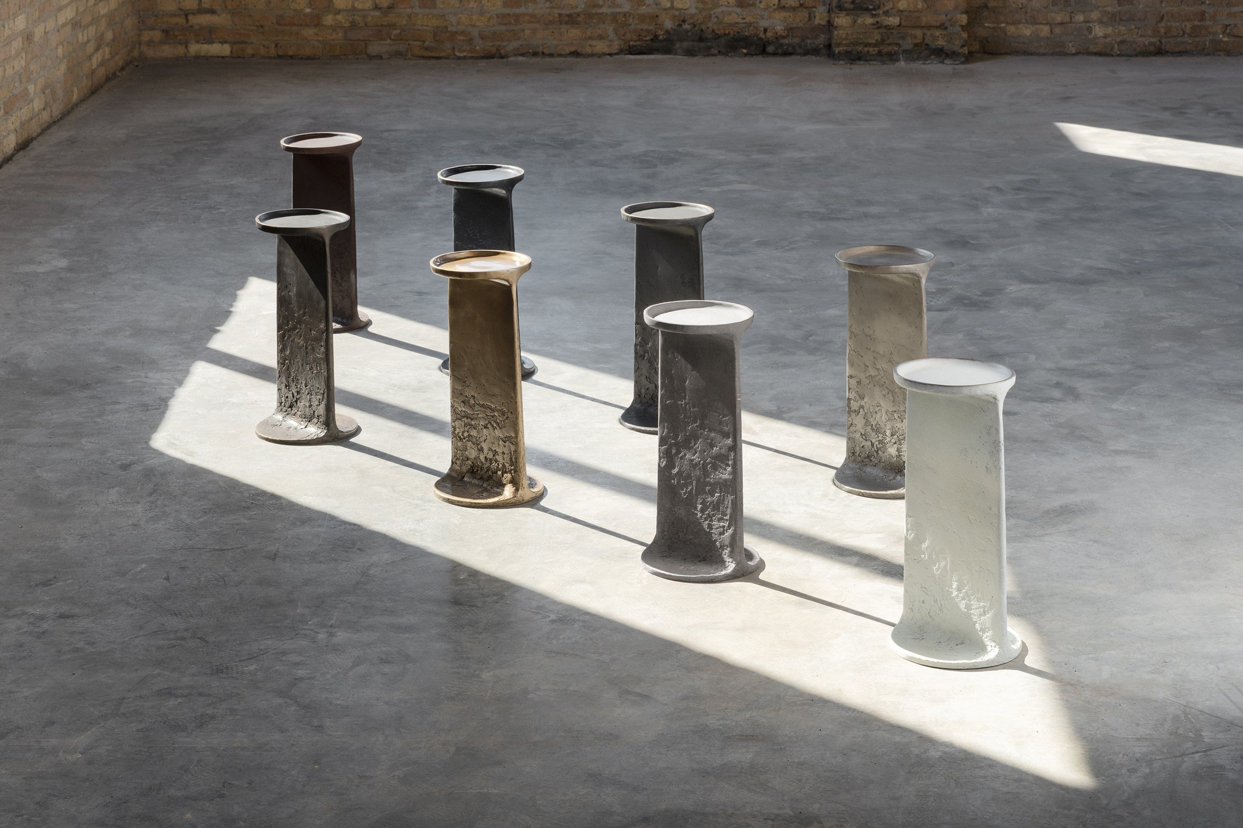
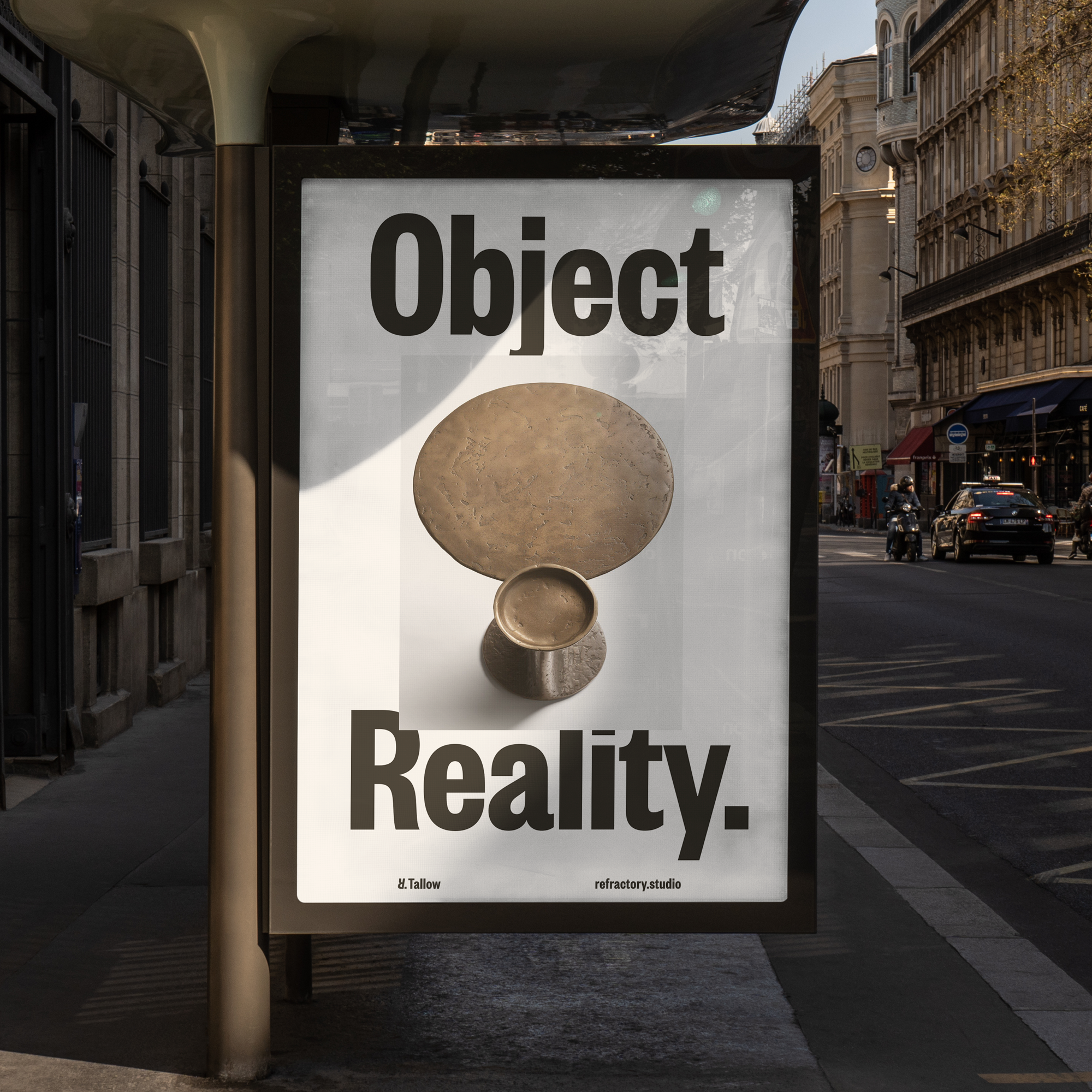
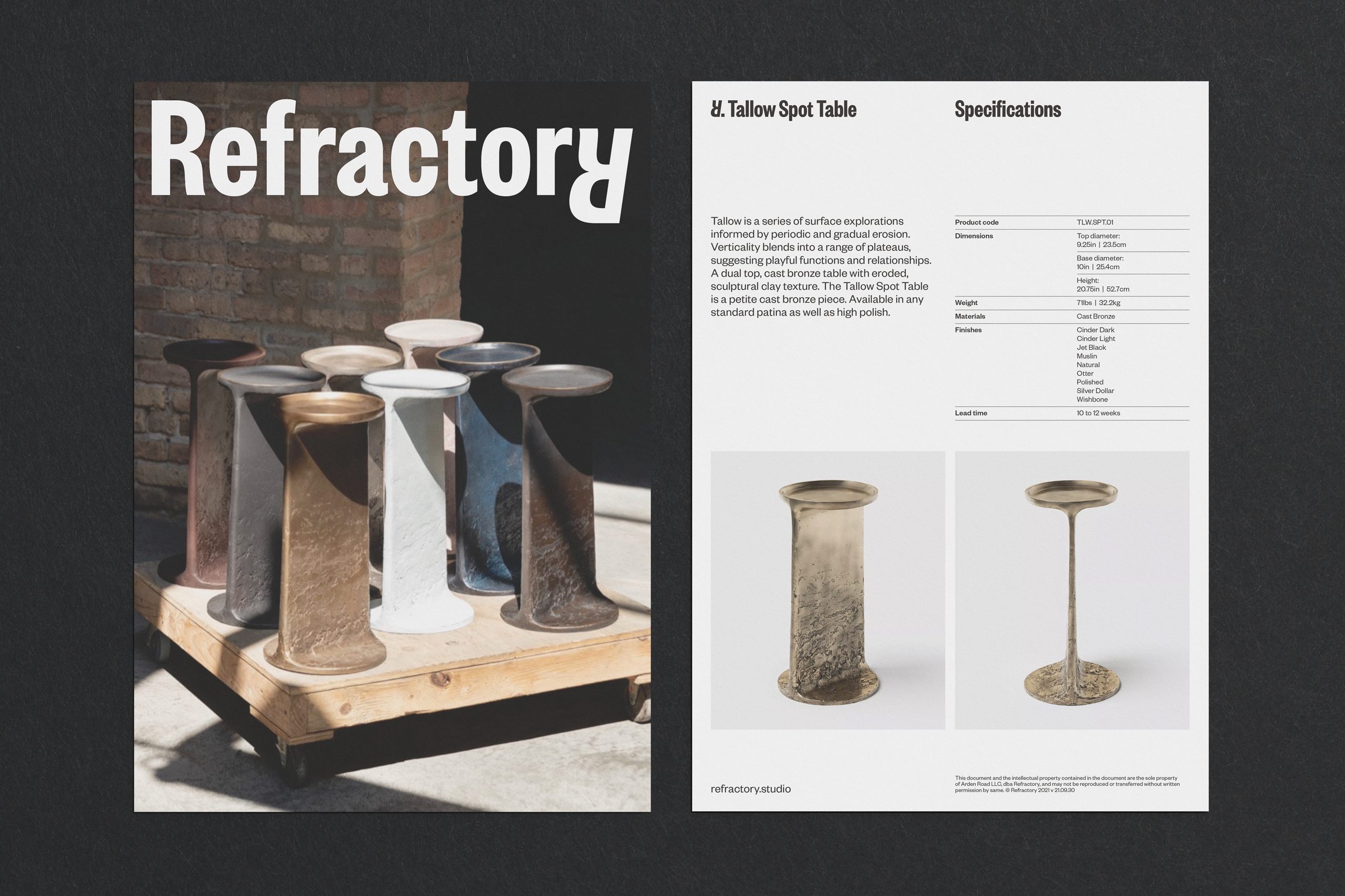
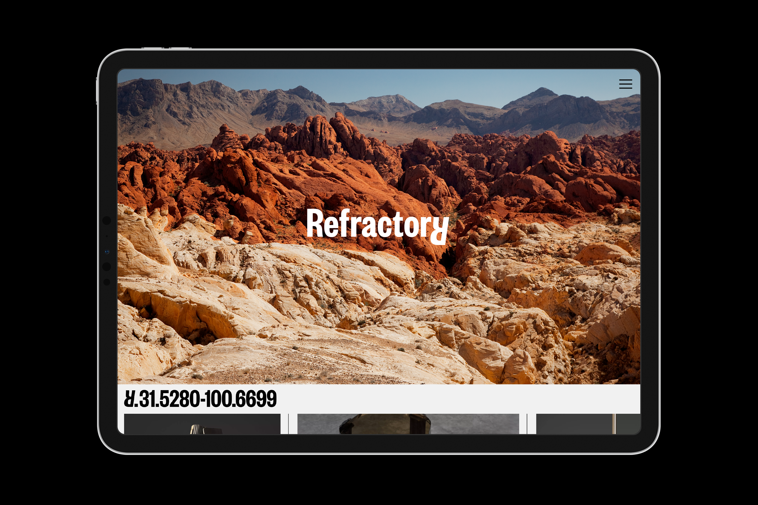
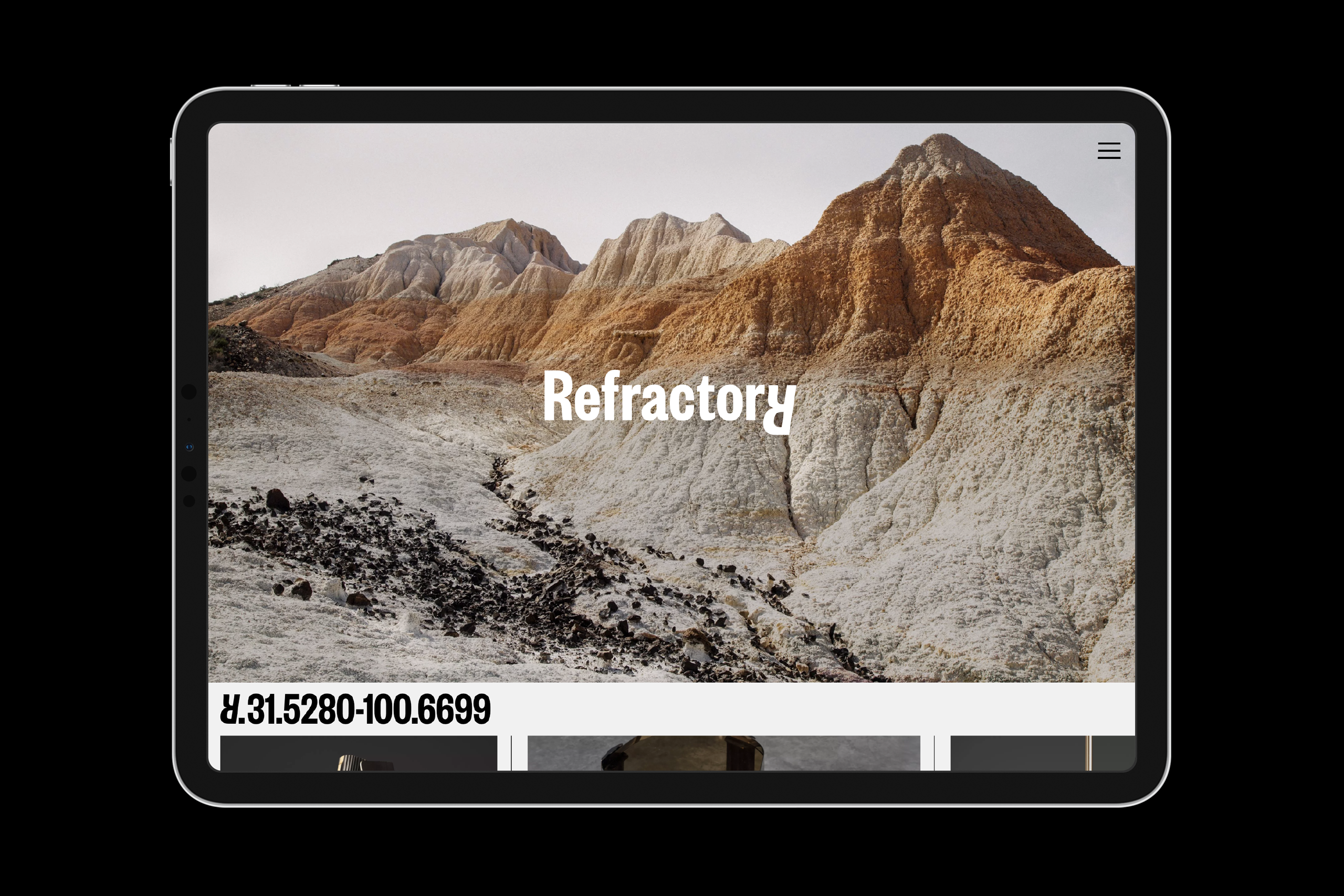
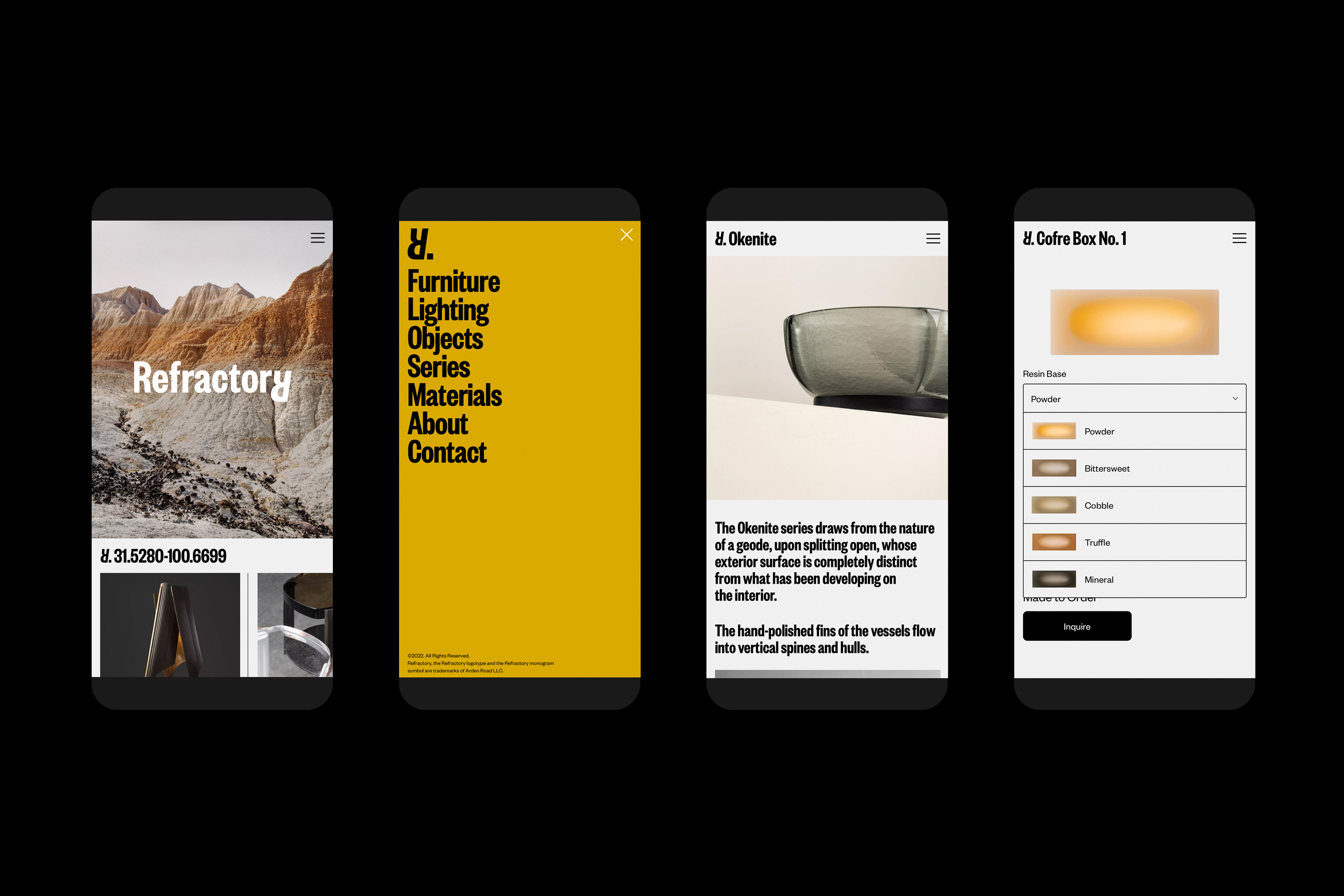
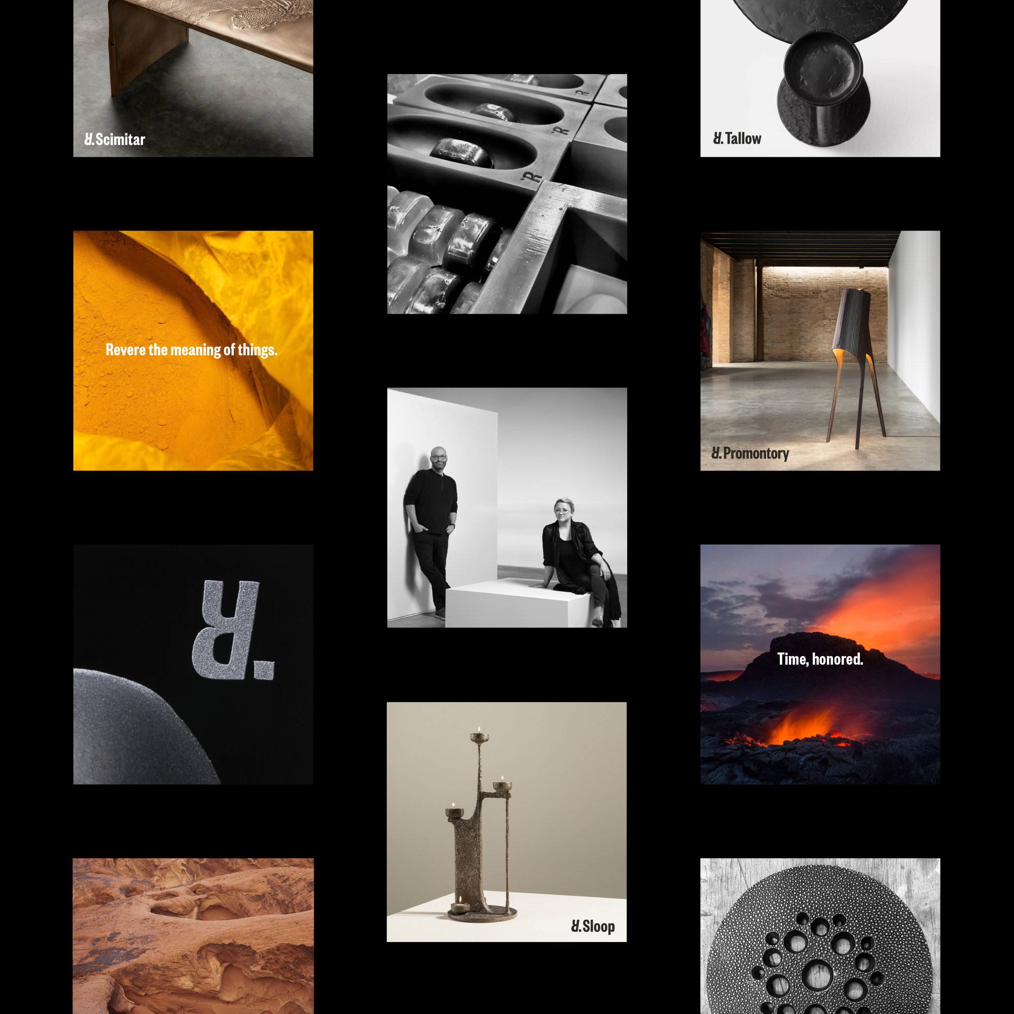
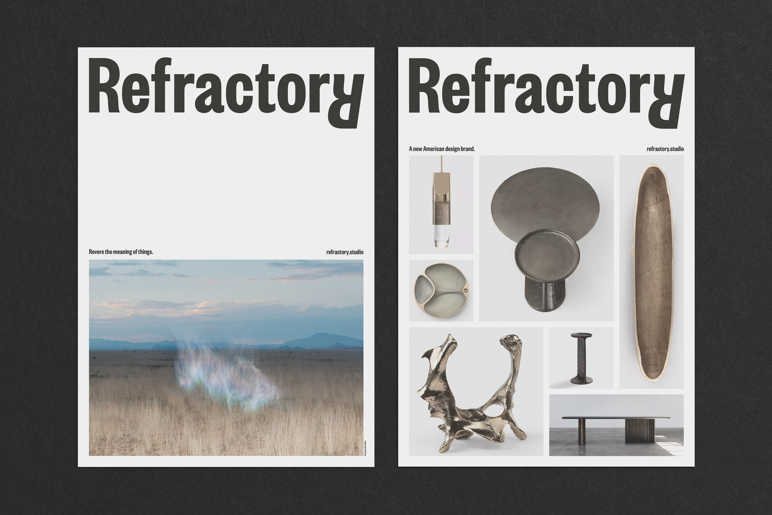
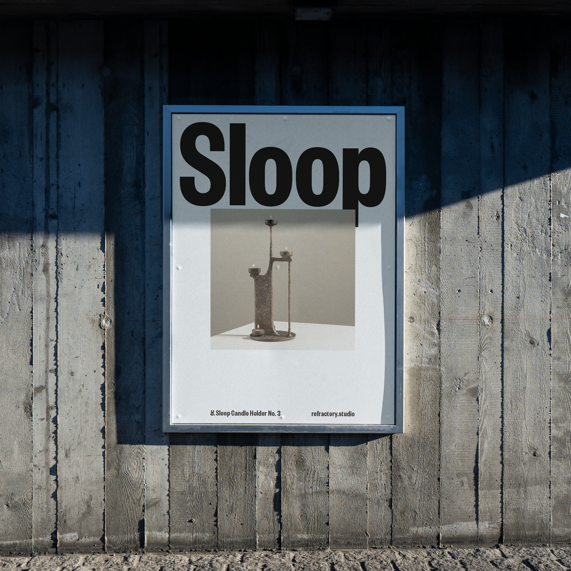
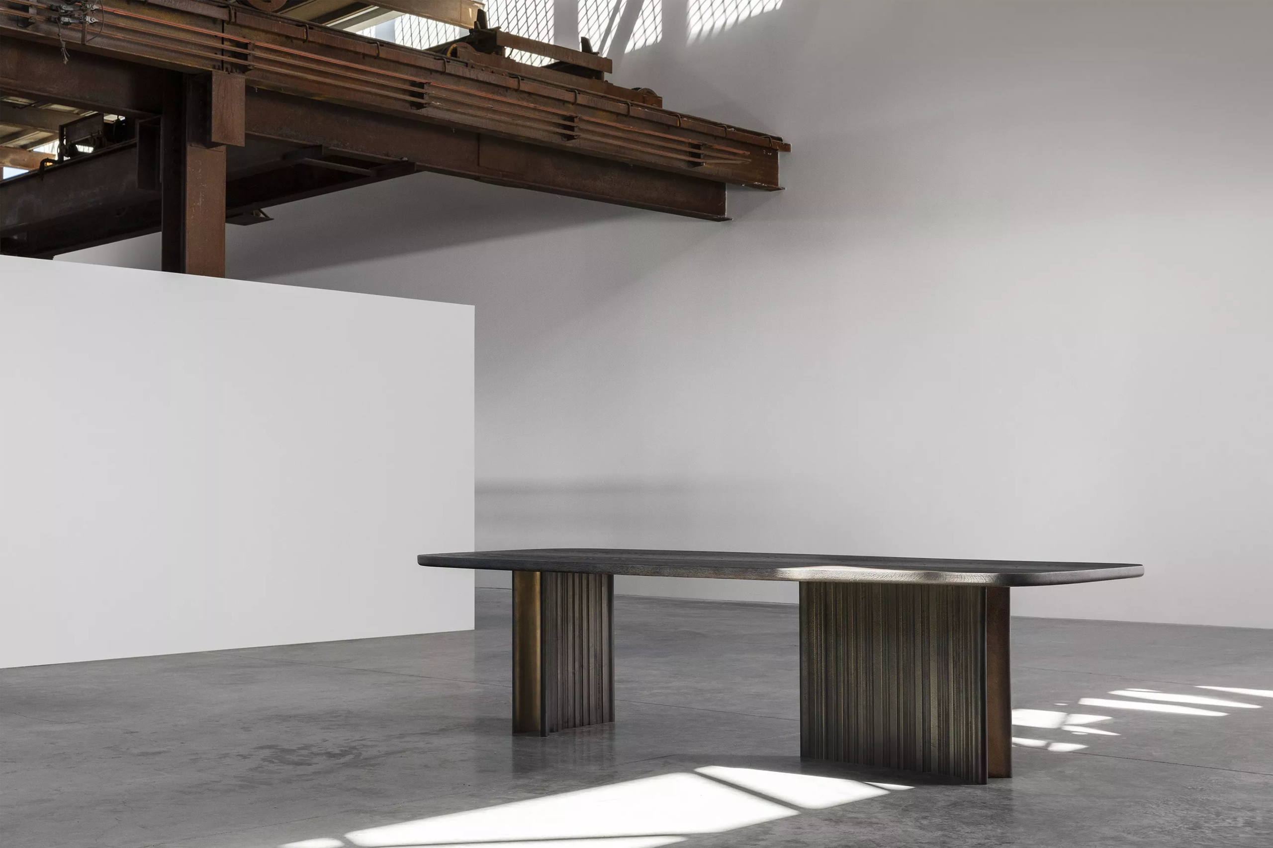
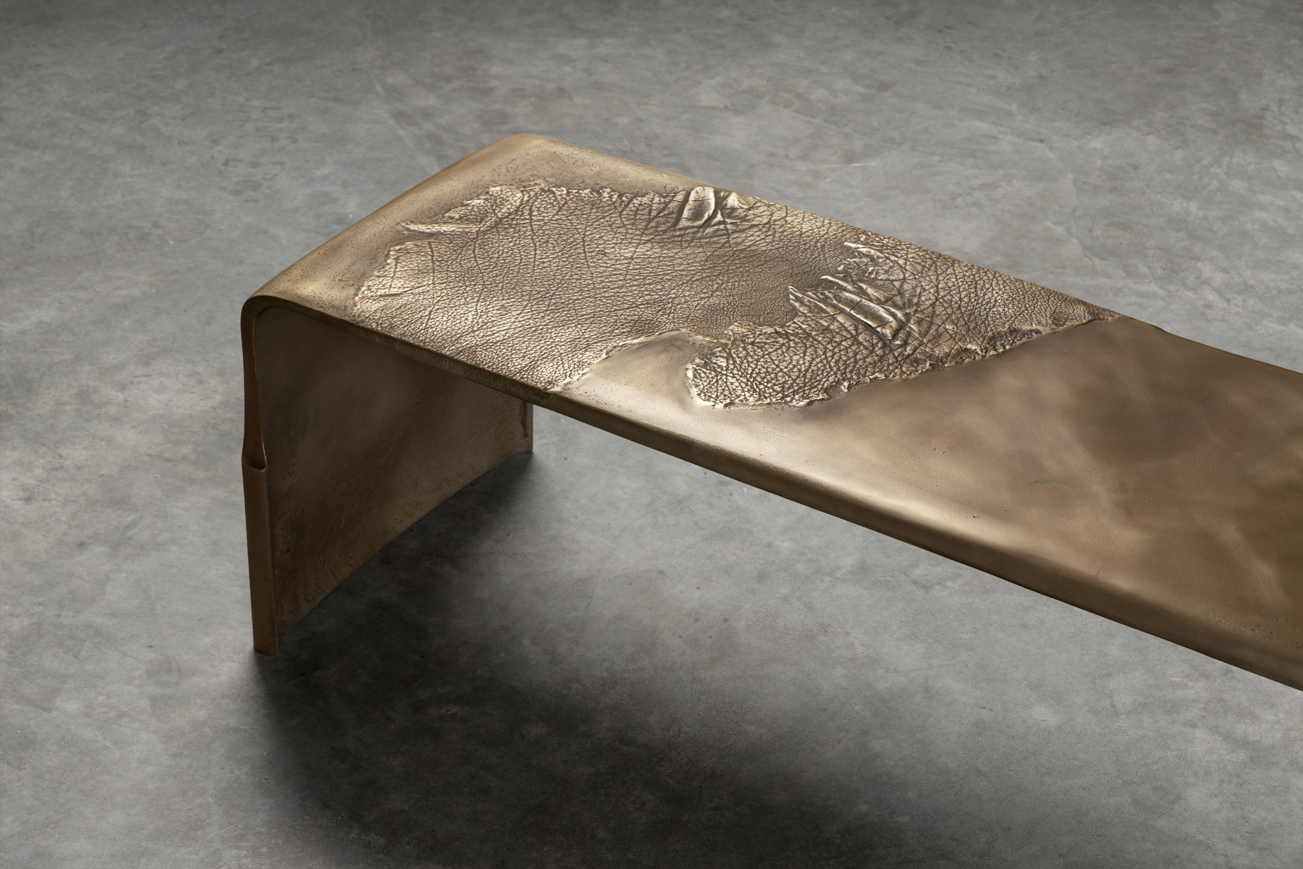
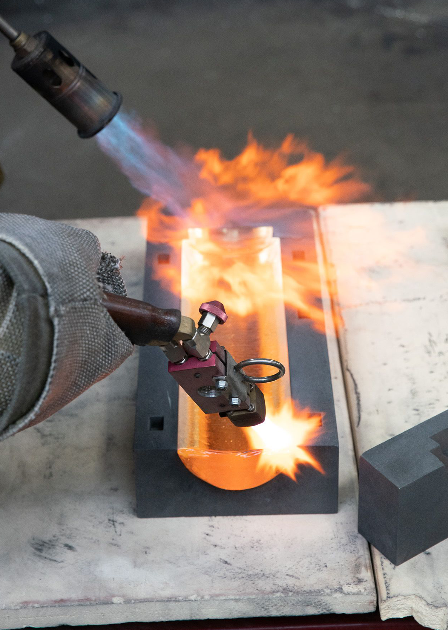
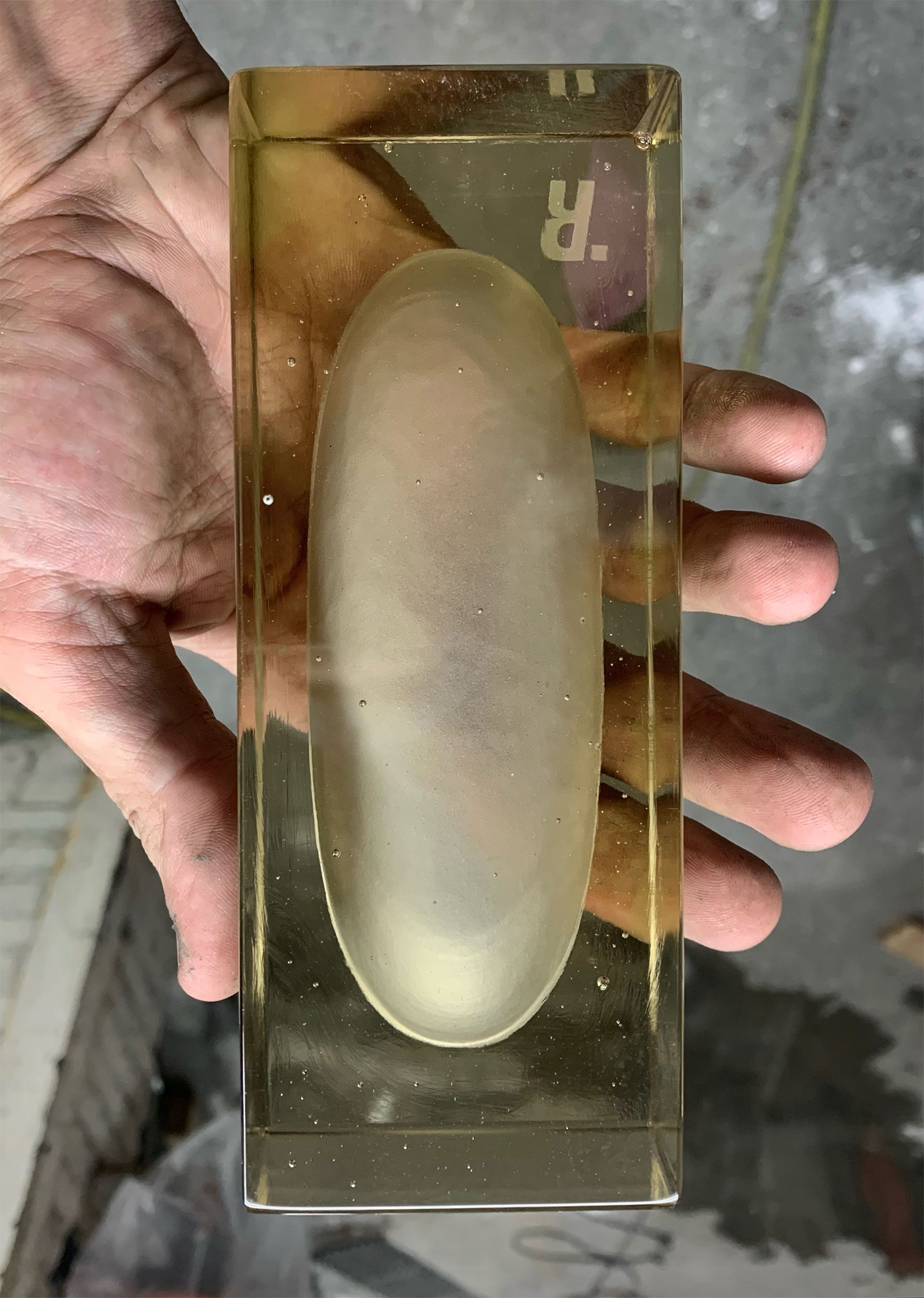
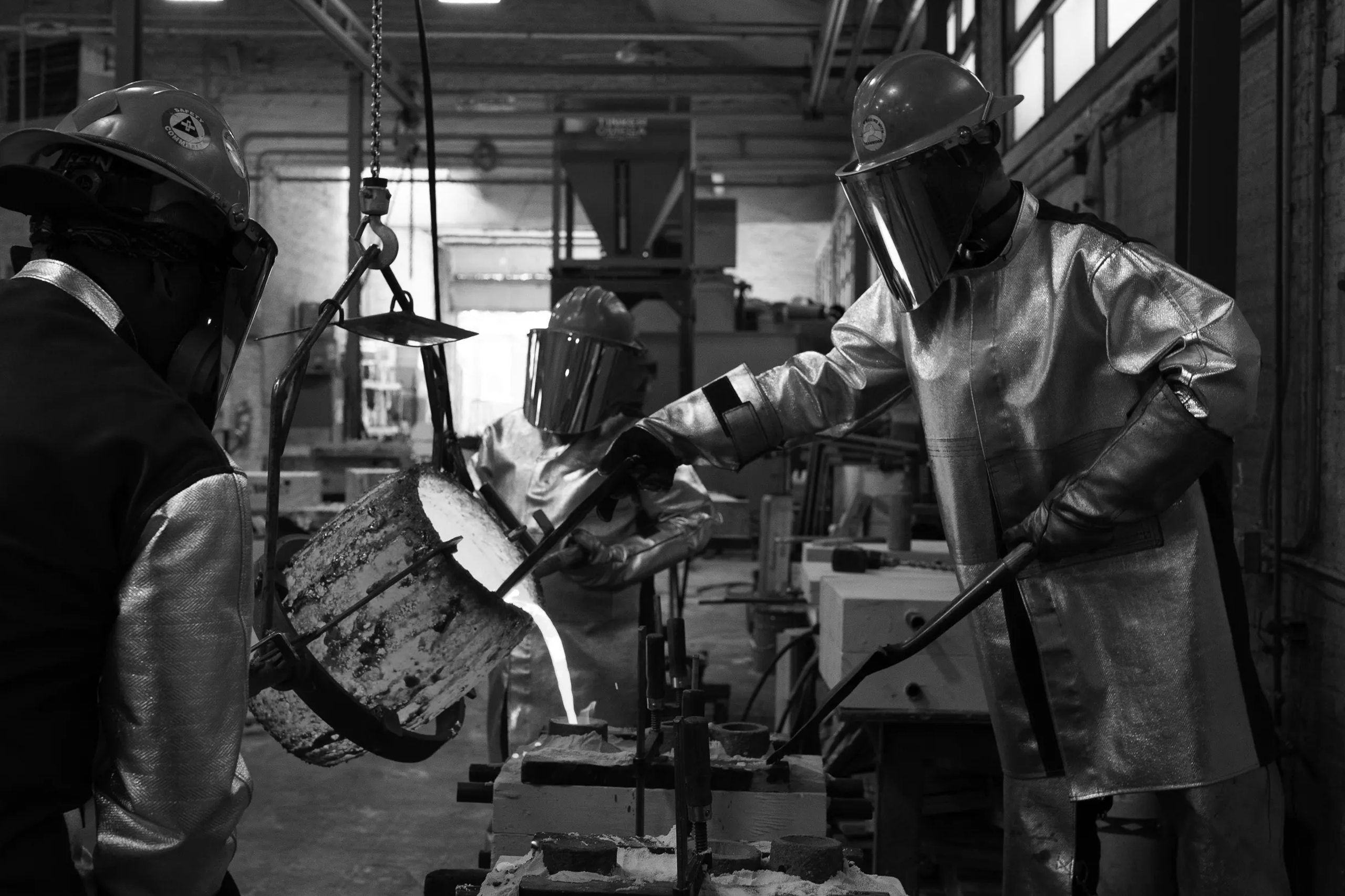
Refractory is a Chicago-based studio specialising in furniture, lighting, and object design. Founded by Angie West from Texas and Alberto Vélez from Bogotá, the studio embodies a distinctly contemporary American design ethos, influenced by the rugged landscapes of West Texas.
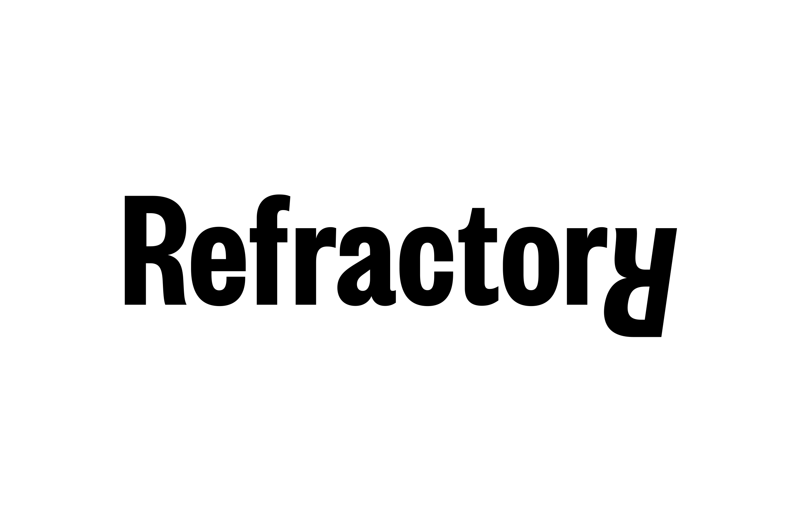
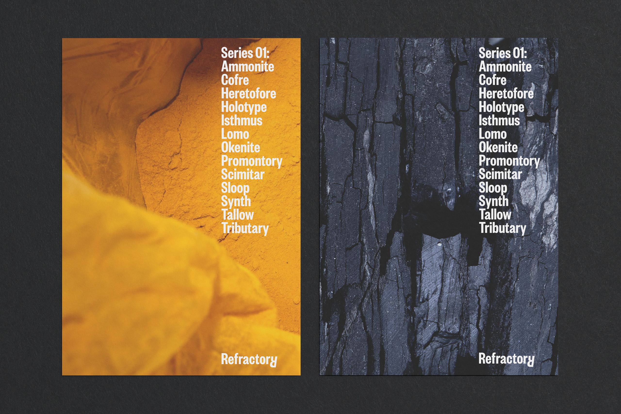
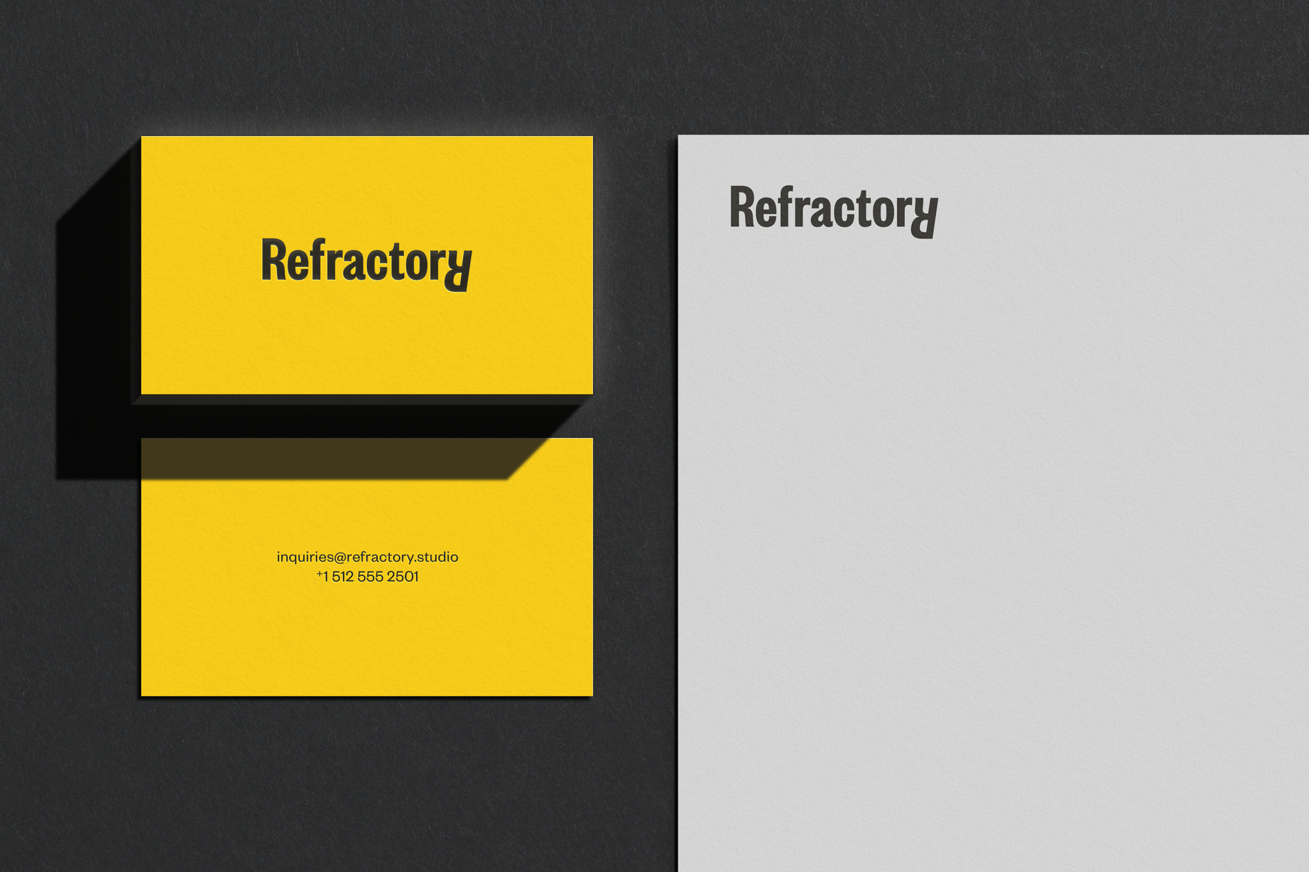
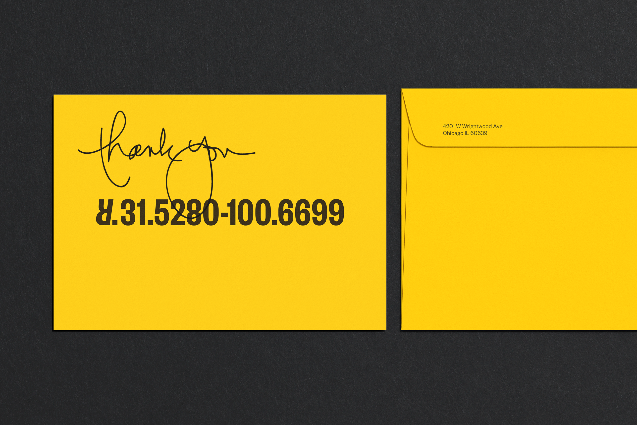
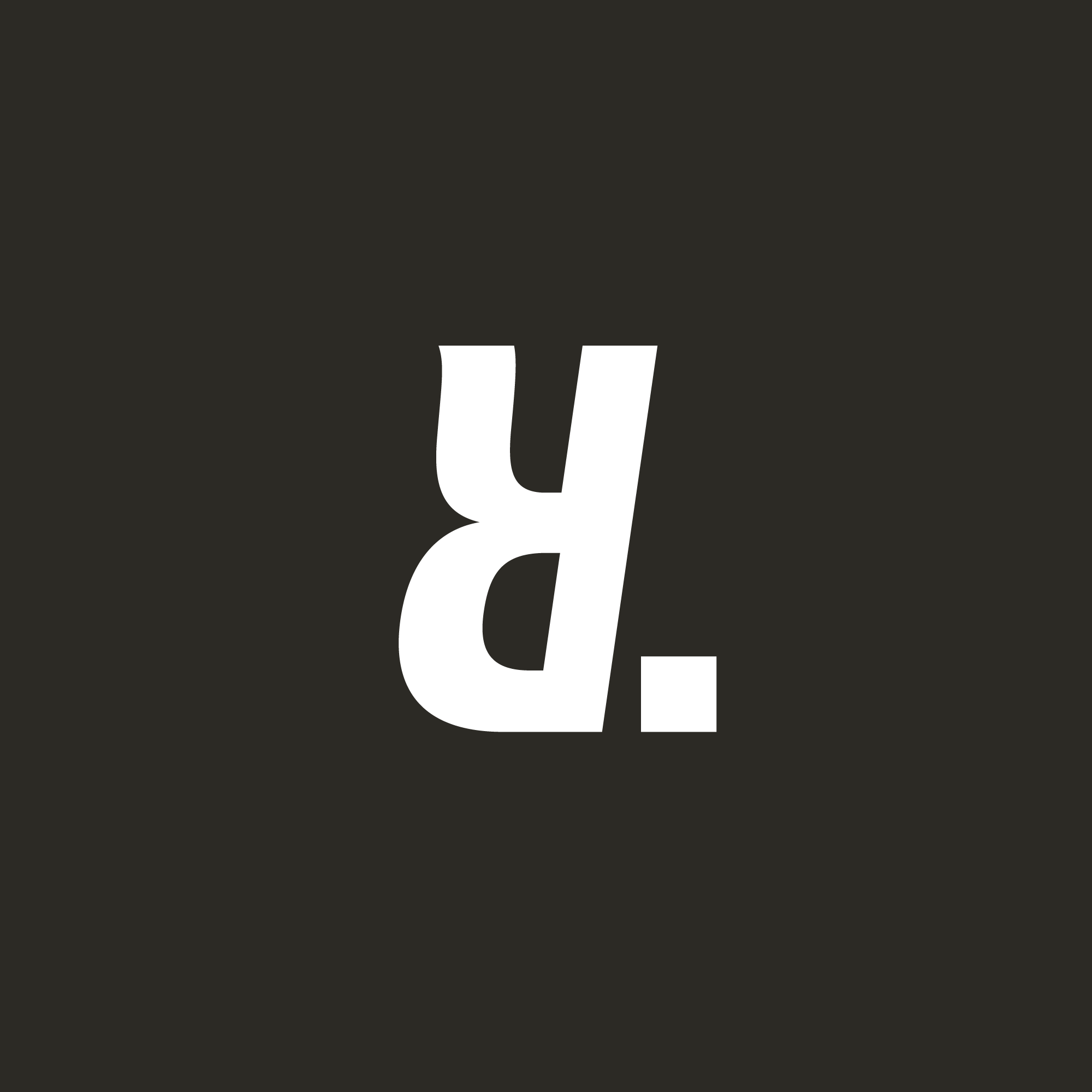
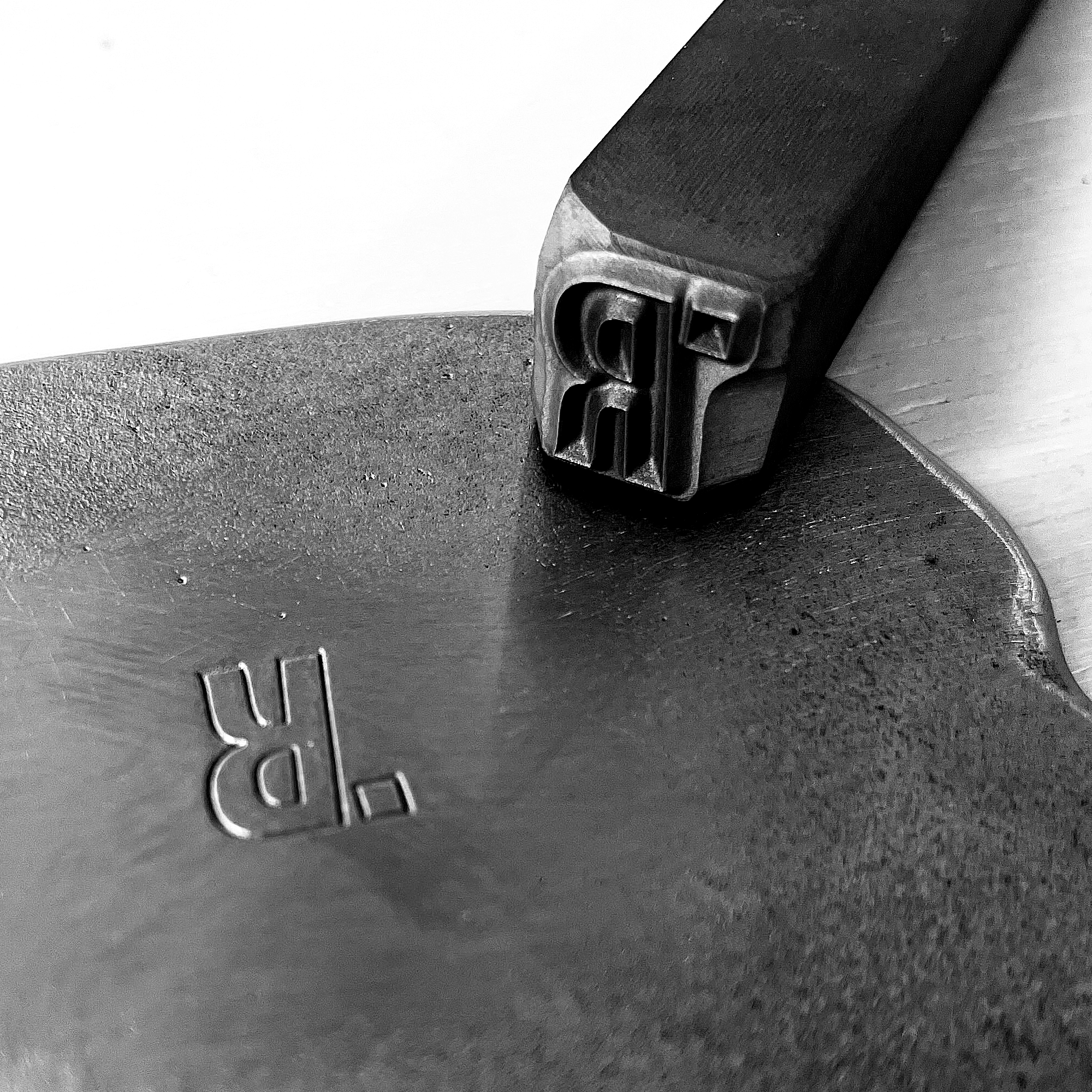
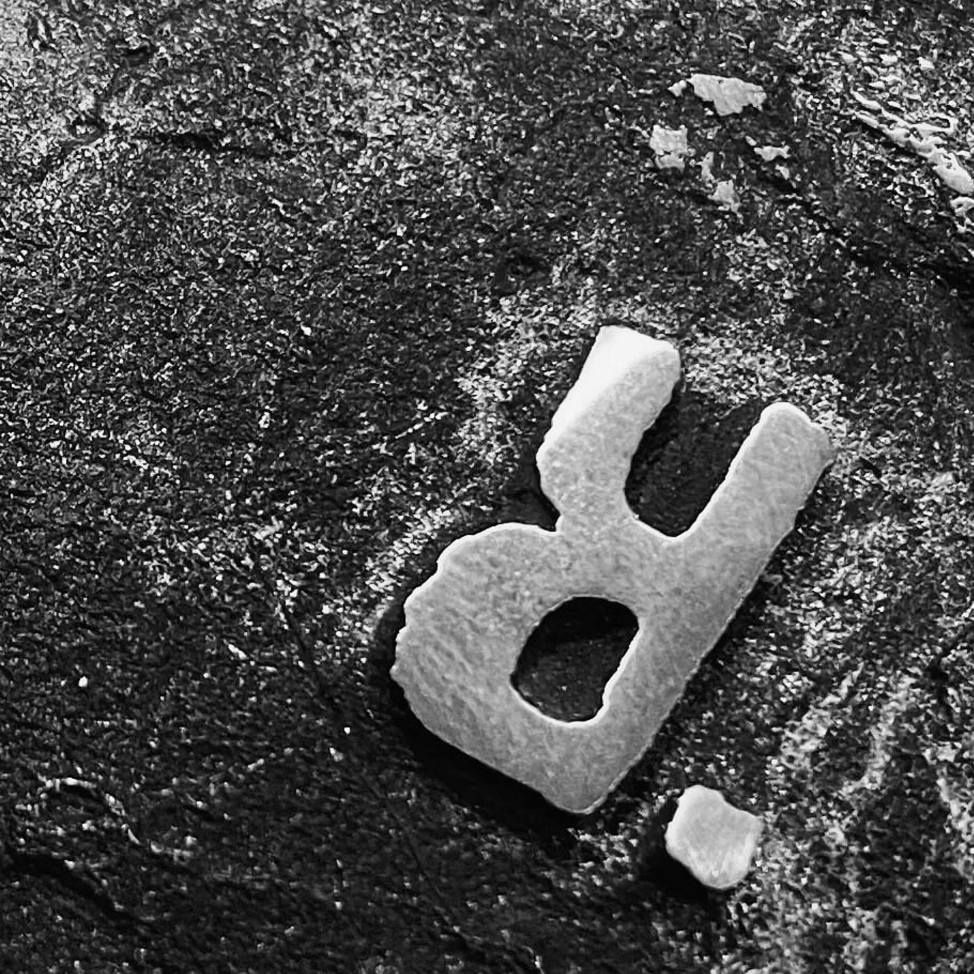
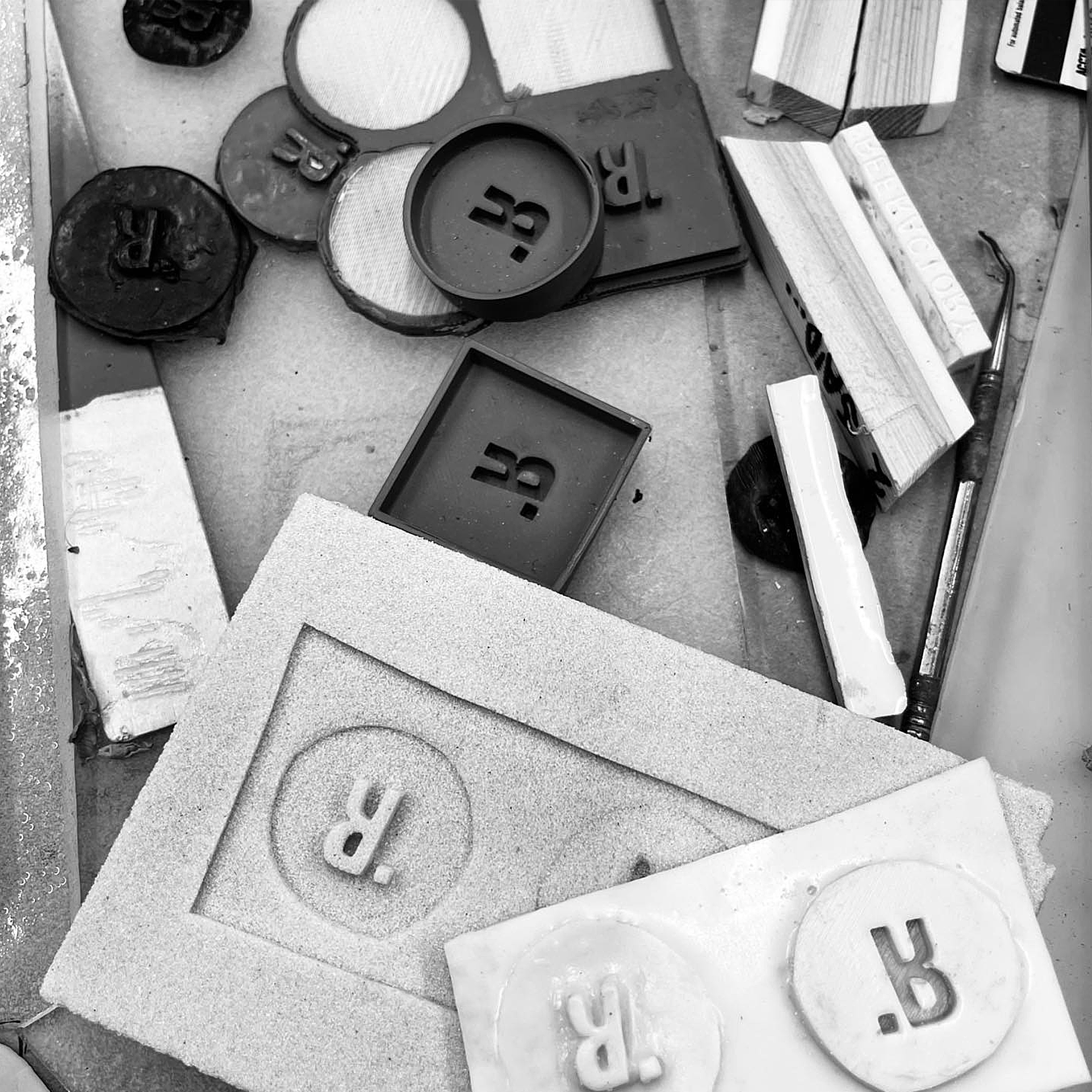
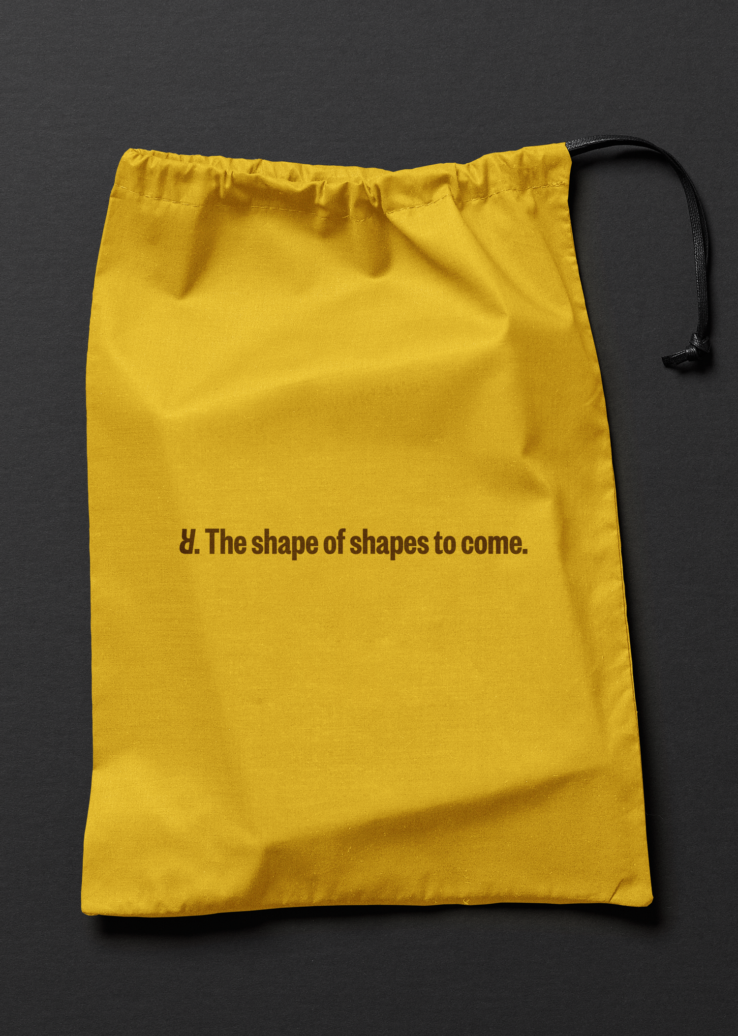
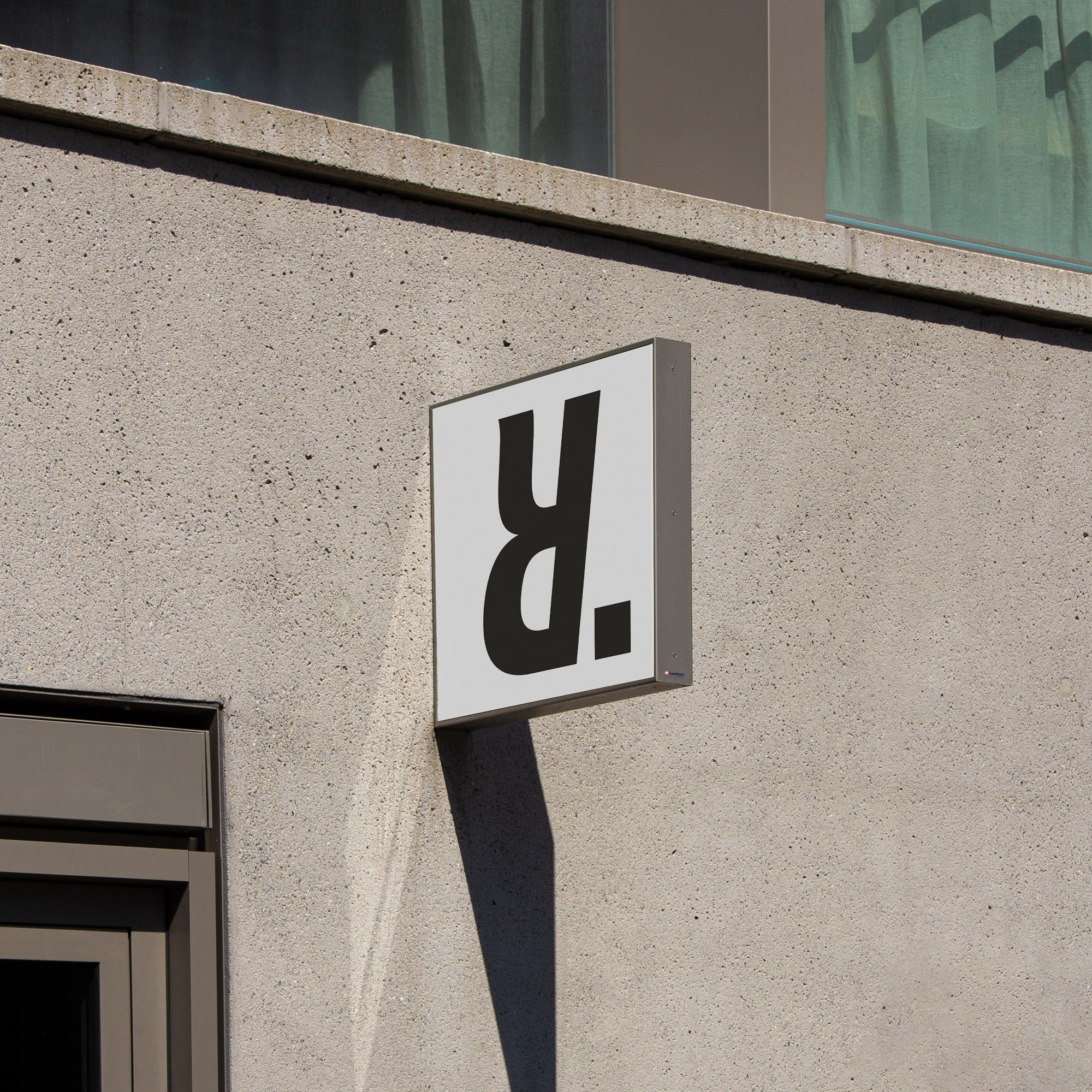
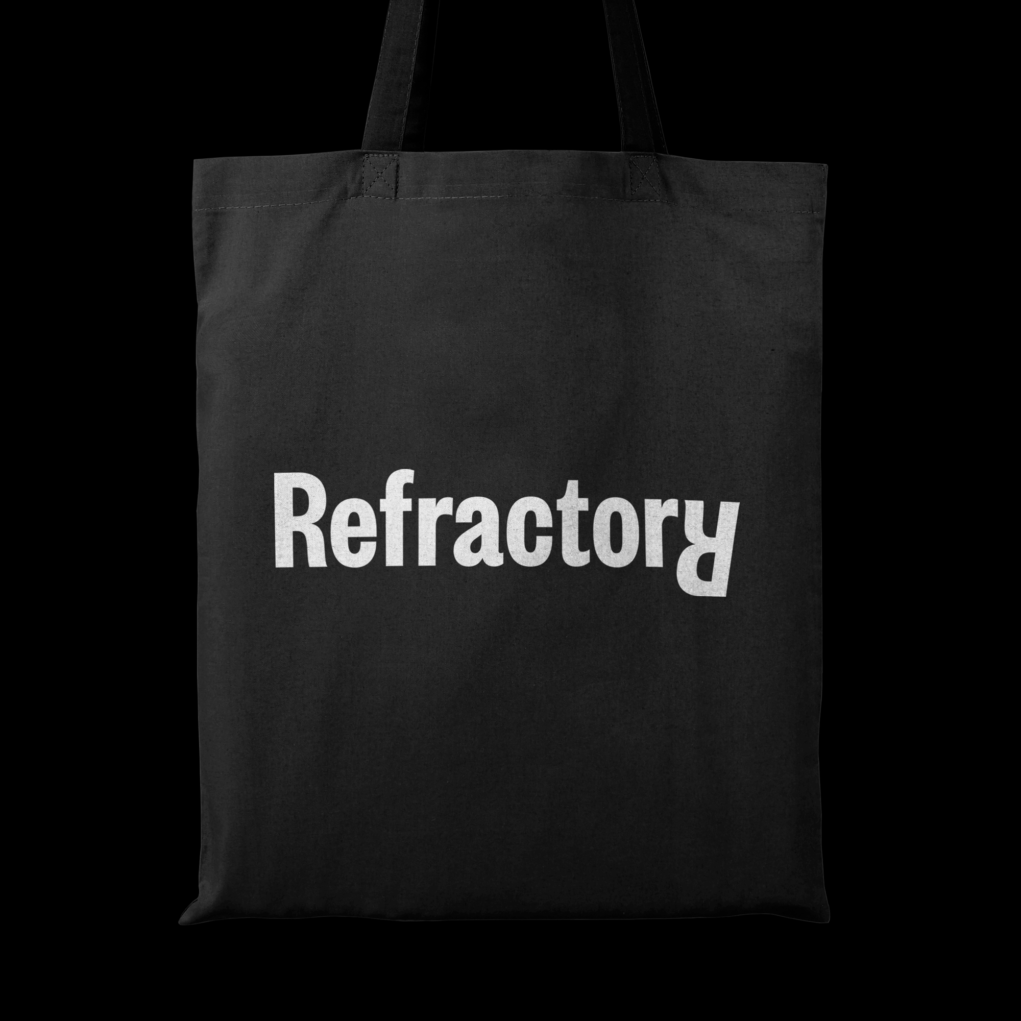
The Refractory wordmark features an inverted ‘R,’ serving as both a brand monogram and a maker’s mark. The name Refractory signifies something stubborn or unyielding, reflected in the flipped R.
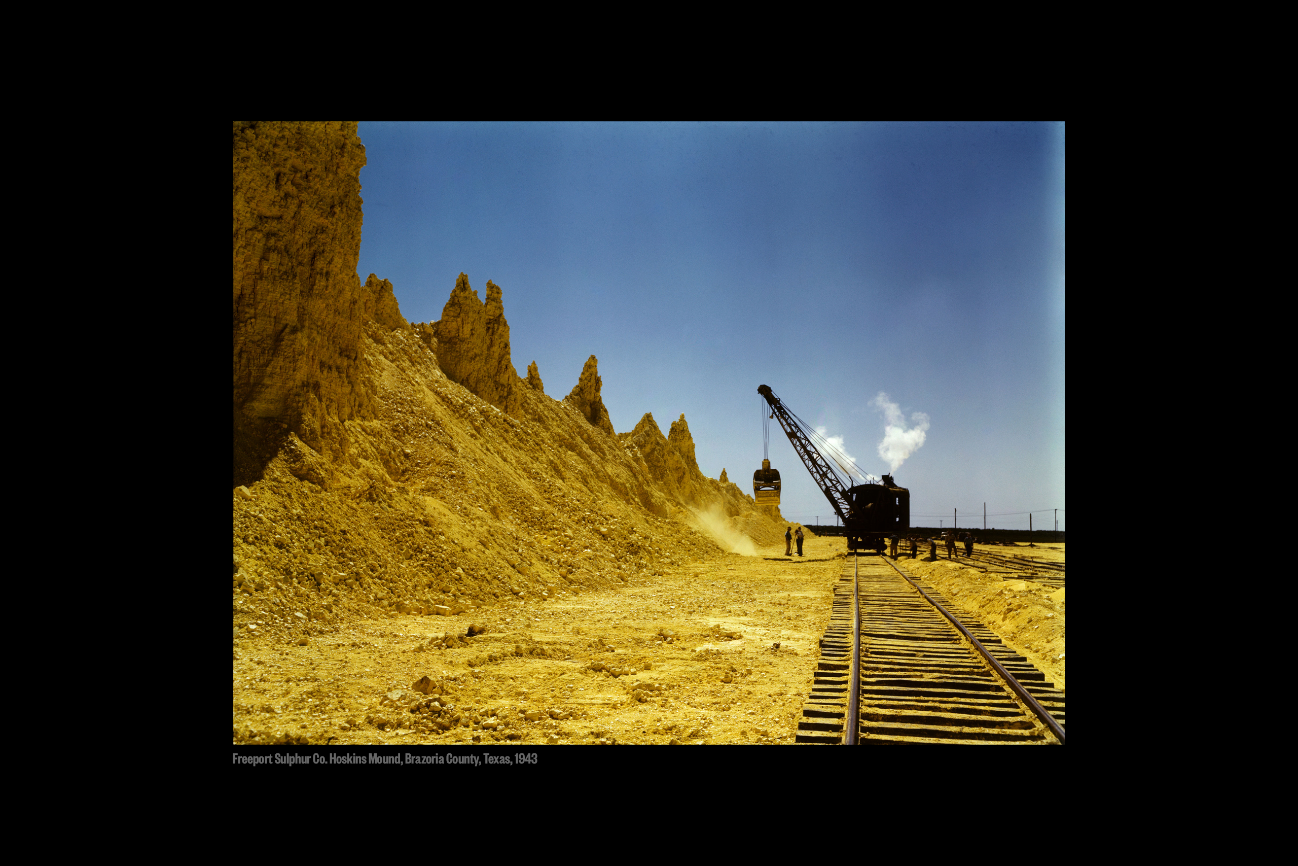
In metallurgy and glassmaking, refractories are heat-resistant materials used in furnaces and kilns. The brand’s signature yellow is inspired by the color of sulfur crystals and powder, a key element in foundry processes.
The Refractory wordmark features an inverted ‘R,’ serving as both a brand monogram and a maker’s mark. The name Refractory signifies something stubborn or unyielding, reflected in the flipped R.
In metallurgy and glassmaking, refractories are heat-resistant materials used in furnaces and kilns. The brand’s signature yellow is inspired by the color of sulfur crystals and powder, a key element in foundry processes.
refractory.studio︎︎︎
Project credits
Creative Director
Brett Wickens
Design & concept
Jeremy Matthews
Strategy
Brett Wickens
Jeremy Matthews
Copywriting
David Begler
Refractory
Web design
Sons&Co.
Typeface
Klim Type Foundry
Product photography
Refractory
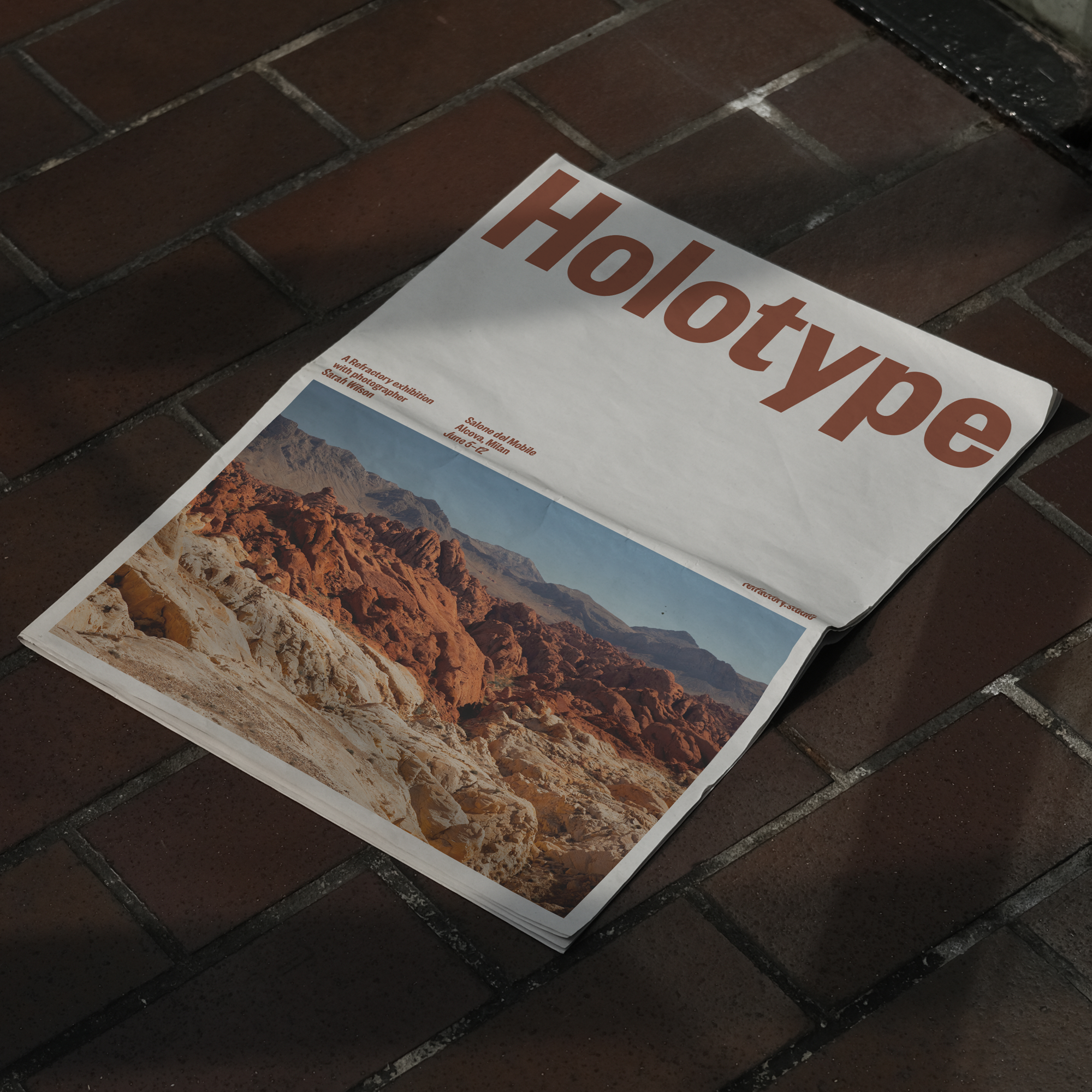
Landscape photography
Sarah Wilson
Inka & Niclas
Client team
Angie West
Tristan Butterfield
Alberto Vélez
Brett Wickens
Design & concept
Jeremy Matthews
Strategy
Brett Wickens
Jeremy Matthews
Copywriting
David Begler
Refractory
Web design
Sons&Co.
Typeface
Klim Type Foundry
Product photography
Refractory
Landscape photography
Sarah Wilson
Inka & Niclas
Client team
Angie West
Tristan Butterfield
Alberto Vélez